That’s right, the Google Play Store logo is getting another redesign after the last one in 2017. This goes without saying that the app itself received an overhaul in 2019, with the web version following suit in late 2021.
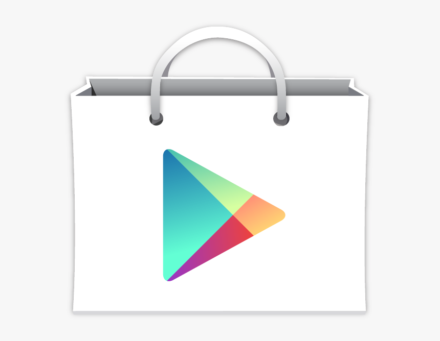
All those years ago, Android Market officially kicked the bucket and transitioned into the Google Play Store. For those who don’t remember, the only thing that was maintained during this transition was the shopping bag in the background. The text was completely changed in favor of a modern look, and the formerly signature green tones were scrapped.
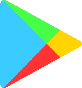
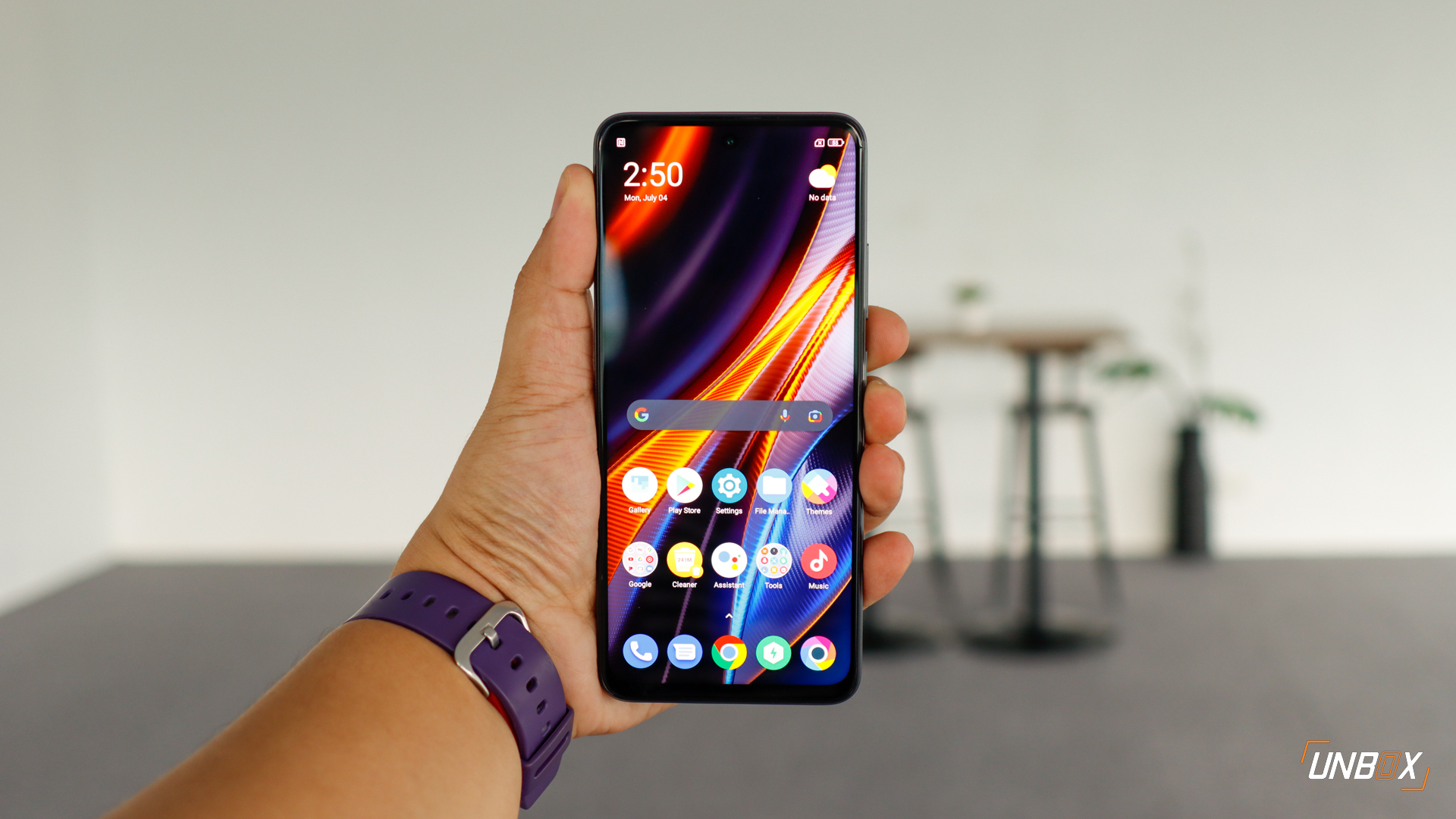
Eventually, in 2017, Google also got rid of the shopping bag and just kept the play button in the center of it. This change made it easier to fit into any manufacturer’s icon skins, whether these were round, squarish, or whatever shape you could imagine. It has been kept since and is what most of us have on our smartphones nowadays.
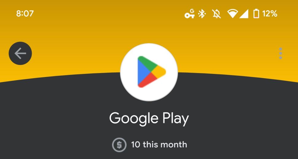
Photo: 9to5Google
From what we know, it hasn’t shown up yet on the Play Store itself. This redesign was just spotted on payment portals such as Google Pay and the like. Based on what we can see, the colors are now much darker than before. The sizes of divisions within the color quadrant are also now more equal, with edges being rounded off instead.
As a result, the Google Play Store logo looks stouter than ever before. The reasons for this change aren’t certain, but we’d say that it looks more or less the same as before. You wouldn’t really notice it unless you somehow paid special attention to the shape and dimensions of the play button over time.
What do you think?


